The Google Drive app will soon get a new design, based on Google’s Material 3 Expressive design.
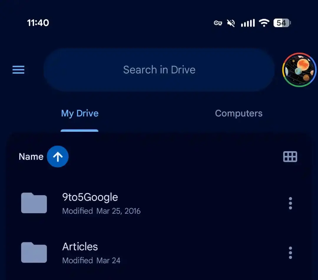
The Google Drive app for Android will soon have a new look. Google is implementing the new Material 3 Expressive design for the Drive app, as noticed by 9to5Google. You shouldn’t expect any major changes. The search bar will get the biggest makeover, and files will be placed in one large container. The rollout has started gradually, but some users can already see several components.
Material 3 Expressive
Google already announced its new Material 3 Expressive design at the launch of Android 16. This allowed developers to get familiar with the new design. Now Material 3 Expressive appears to be ready for Google Drive.

The biggest change is the search bar where the hamburger menu and profile photo appear next to the bar. The bar is also much thicker than before and contains the central text “search in Drive”. Additionally, the list of files is placed in one large container. This container gets a slightly darker color than the rest. Google also provides a combined button that lets you switch between grid and list views.
read also
Google Photos app gets search button for editing tools
The new design appears in Google Drive Android version 2.25.310.0. The rollout is happening gradually, but some users are already seeing several components.
